Wednesday, March 14, 2012

That Little Green Button

You know those three buttons in the top corner of almost every window you use (whether in Mac OS or Microsoft Windows)? The red one is the same for both. Everyone know that clicking this button will close the window. The one with the minus sign (yellow in Mac OS X) is pretty straightforward. You click this one and the window minimizes into the dock. It is the third one (green plus sign in Mac OS X, rectangle shape in Windows) however, which causes most problems. In Windows, this button is a toggle, setting the window to either your screen size or a user-defined window size. In Mac OS X, this is not so simple. In general, this button resizes the window to a 'reasonable' size. This usually means cutting out whitespace on the sides of a window (in a browser or document editing program, for example). In iTunes however, this button changes the window to a "Mini Player". Because this button has so many different conditions and possibilities, it almost seems unpredictable.
As a big fan of screen real estate, I like for my windows to be as large as possible. Because the green button isn't reliable for a full-size toggle, I end up doing a lot of manual clicking-and-dragging from the edge of a window. One day in my Internet travels, I encountered a little tool called Right Zoom (downloadable here) that allows you to mandate the action of the green button.

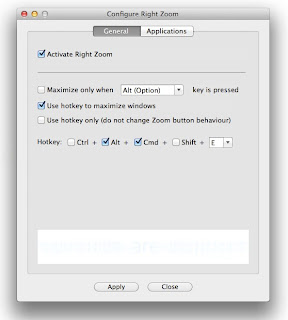
Using this program allows you to have the green button behave similarly to the maximize button in Windows. You can also set a hot key which, when pressed, allows you to have the green button behave in a specific way. You can also set the green button to perform different ways with different applications.


As soon as I started using Right Zoom, resizing windows was a breeze. The beauty is that you don't even have to worry about the program itself. It's not even like it's a utility. I'd describe it as more like an extension of a system preference pane. All you need to do is download it, set it up how you want and forget about it.

I would recommend this tool for anyone who likes to use as much screen space as possible and likes to keep things simple in the process.

Saturday, July 23, 2011

A Domesticated Lion

This review is designed to bring to light some of the less promoted features of Apple's newest operating system, OS X Lion. After using Lion for about two days, these are changes that I noticed most evidently. Included are screenshots of some of the new changes. The differences will be discussed in order of how I noticed them. First, we'll start with autocorrect.

01) Autocorrect:

       After downloading and installing Lion on my machine, I checked Facebook to see what I'd missed in the past half-hour. Upon leaving a comment about a game of hackey sack, I reread the comment after it was posted and found it to say "hacker sack". Immediately I opened System Preferences in search of disabling this so called 'improvement'. Under Language & Text > Text, there is a check box to allow the automatic correction of spelling (see image). I don't understand the need for autocorrect in a desktop operating system. If I have a full keyboard, I'm more likely to type exactly what I mean to type. Also, the red dashed underlines are enough to bring a potential error to my attention without changing what I typed.


02) Scrolling:

     By now, everyone is accustomed to the two-finger scrolling. You pull down on the trackpad to go down the page and you push up on the trackpad to go up the page. Well, now things are different. Now you pull on the trackpad in the direction you want the page to go, as if the trackpad is a continuation of the screen. This too can be disabled in the System Preferences menu under Trackpad (see image). By now, I am used to the inversion of scrolling, but I was confused at first. 

     
     Also included in scrolling changes is the scroll bar itself. The scroll bar bares a new, humble look and can be set to hide when not in use. I especially like this feature because it leaves more room on the screen for content and cleans up the window a bit. 
03) Bye Bye Rosetta: 

     I went to finish an image project that I had been working on when much to my surprise, Microsoft Word 2004 refused to open. The error message read: "You can't open the application Word because PowerPC applications are no longer supported." Okay... So I guess I won't be using Office '04 anymore. I was in a hurry to finish this project so I went to my school's website and downloaded my free license of Office 2008 and the subsequent updates. When I went to open Word this time, I was informed that Microsoft Office did not install correctly. In my research (and after three failed attempts at installation), I learned that whereas Office 2008 itself does not require Rosetta, its installer application does. I will have to wait until August, when my school will make Office 2011 available for download. Between TextEdit and OpenOffice.org, I think I will be able to manage until then.


04) Dictionary:


     Now those of us who are not versed in the ways of British English have the tools necessary to comprehend this cryptic language. Dictionary is complete with a British Dictionary and Thesaurus, along with an Apple dictionary. Also in the new version of Dictionary, there is a side bar which provides suggestions related to the query. Rest assured, you can still click on any word it the content as a hyperlink. Alternate-clicking on any word in any text field within the entire OS provides the option of looking up that word with a brief pop-up including the dictionary definition and synonyms.


05) TextEdit:


     The TextEdit menubar has been revised and now includes easier options for changing the typeface and other such settings.


06) Volume Adjustment Image:


     As trivial as it may seem, even the volume adjustment image has been given a facelift. I suppose thinner sound wave lines and an elongated speaker body make this indicator seem more Lion-esque. What bothers me is that while the volume image is changed, the brightness image remains the same.


07) Safari:


     Safari got a little touch-up here and there. Now users can compile a Reading List for future moments of boredom. The brushed aluminum title frame has a slightly altered pattern. Most notably, the Downloads window is no longer a window. It is instead a drop-down list of recent downloads.


08) Window Titles:


     It may (or may not) be of note that the red, yellow and green buttons are slightly different in appearance. Less notable, the title text is no longer black, but rather a light gray. I see this as if the aluminum frame were merely stamped or engraved, without the engraving being filled in. Finally, windows can be resized by placing the cursor on any edge or corner (even on the top of the window) and causing it to become one of a slew of arrows, allowing the user to click and drag to the desired size.


09) The Voices:


     Perhaps the most exciting new feature of Lion is the plethora of new, multilingual voices. Don't worry, you can still listen to Bubbles or Junior to quench your thirst for OS 9 nostalgia, however, I much prefer to hear the reassuring voice of my Indian guide, Sangeeta whenever I get an error message. There are seemingly hundreds of new voices available for download right in the Speech menu of System Preferences.


10) About This Mac:


     The changes to the About This Mac cause the informative program to be significantly simpler to understand. The program System Information still works the same way, but About This Mac simplifies the basic features of the system. 

     Under Storage in About This Mac, there is a summary of the disks. This much resembles the summary of an iPod's content when viewed through iTunes. The new feature may prove helpful for someone who needs to determine how to provide for more space on their main drive.


11) Application Return to Previous State:


     Similar to the iOS, when an application is closed and re-opened, it is restored to its most recent state. This feature can be useful, but can also be undesirable. It can be disabled in System Preferences under General by the check box for "Restore windows when quitting and re-opening apps".


12) Minimize Windows into Application Icon:


     Now it is available to have minimized windows store under the application icon in the dock instead of staying on the far right side. This may be useful to maintain a less cluttered dock, but I find it difficult to manage when minimizing multiple windows from the same application.


Over all, I think Lion has many little improvements, few useful major improvements and depending on how often you use PowerPC applications, one major disadvantage to Snow Leopard.

Also of note: The term Wi-Fi is often used in place of the term AirPort and the 
term App is often found in place of the word Application.


Thursday, June 23, 2011

Dvorak Simplified Keyboard Layout

Although it is the most common keyboard layout, QWERTY is by far not the most efficient. Many people are unfamiliar with the highly efficient Dvorak keyboard design. Developed in the 1930s, the Dvorak Simplified Keyboard Layout is designed as an alternative to the sluggish QWERTY setup. Whereas it may prove difficult to learn a different keyboard layout in a QWERTY-dominated world, there are ways to adapt one's typing habits. Primarily, the input for a computer system may be adjusted rather easily in the settings menu. Both Mac OS X and Microsoft Windows operating systems, along with most Linux distributions allow for easy changing of the keyboard layout. Secondly, if so desired by the user, various physical keyboards are available for purchase. For Apple users, websites such as this one offer keyboard overlays, including a Dvorak layout. These are advantageous because they allow the user to use the same keyboard as before, but see the letters in their new positions. The Dvorak Simplified Keyboard Layout is highly suggested for anyone who finds difficulty in using the QWERTY layout or who just seeks new challenges and wants to learn a different way to type.