Do you know it is possible to customize the icon of (almost) any file, folder, application, etc? In this article we will discuss the easy, fun way to personalize your dock and desktop in the Mac OS environment. Let's get started.
1)
First things first:
Find out what you want to change. As previously stated, this could be the icon for a file, folder, application or even a drive. For example, I recently began to use the Terminal utility rather heavily, so I decided to give the icon a more personal touch.
2)
If you're going to replace something, you should know what you want to replace it with. Perhaps you have something in mind already, but sometimes we all need a little inspiration. To see some good examples of possible icon choices, direct your browser to iconspedia.com. This site has plenty of icon packs to choose from. If you desire a specific image as an icon, try a Google Image search.
3)
Once you have the icon you want, locate the application you want to change in a Finder window. Then right click and select "Get Info". You'll notice the current icon displays in the upper left corner of the new window. Keeping this window open, go through Finder and open the "Get Info" window for the icon file as well.
4)
Now that you have both of those windows open, here's the trick. Click once on the image displayed in the top left of the "Get Info" window of the icon you want to use. It should now have a blue shadow around it. Use your keyboard shortcut keys of +C to copy the image. Then go to the "Get Info" window of the icon you want to change. Click on the image in the top left corner and press +P to paste the image. This should properly copy your icon file to the new image. If this doesn't work and your Mac honks at you, it may be because the file or program you are attempting to change is protected. Perhaps you could change the permissions from the "Get Info" window while you are there.
Sunday, October 07, 2012
Monday, July 09, 2012
More about Dvorak Simplified Keyboard Layout
.jpg) |
| Logitech K360 White (before modification) |
I truly enjoy using this keyboard for all sorts of purposes. When I'm using my MacBook at my desk, I usually have it closed, in a drawer and connected to my 22" Acer monitor. This wireless keyboard, when combined with a wireless mouse, provides me the ability to use my MacBook just as if it were a desktop computer. When I go to work or to computer science lab sessions, sometimes I bring my keyboard with me just to have the familiarity and comfort of my own keyboard (not to mention the hygienic benefits). It conveniently has a slot to keep the nano-sized USB adapter and fits easily in my backpack. I've quickly become accustomed to going into the "Regional and Language Options" in the Windows Control Panel and adding the Dvorak layout as the default input.
During one of my more recent Windows installations on a project computer, I was pleased to find the option to use an input layout other than QWERTY. I immediately jumped at the opportunity (it had one of those countdown timers) and continued my installation with the use of my very own Dvorak keyboard.
To someone considering the switch to Dvorak, I would say that it's a fairly seamless transition. Existing computer setups easily accommodate the alternative layout and you can easily convert a QWERTY keyboard into a Dvorak layout. Also, beware that you may get funny looks from anyone who attempts to use your keyboard or even happens to notice your "strange" layout. You may want to prepare a sort of elevator pitch about your keyboard for the sake of saving time and effort explaining your divergent ways to the whole of humankind. My only complaint regarding the integration of the Dvorak keyboard is that iOS devices do not offer this layout as a software input option. Otherwise, I find Dvorak to be a perfectly compatible, easy to learn and more efficient replacement for the classic QWERTY layout.
Wednesday, March 14, 2012
That Little Green Button
You know those three buttons in the top corner of almost every window you use (whether in Mac OS or Microsoft Windows)? The red one is the same for both. Everyone know that clicking this button will close the window. The one with the minus sign (yellow in Mac OS X) is pretty straightforward. You click this one and the window minimizes into the dock. It is the third one (green plus sign in Mac OS X, rectangle shape in Windows) however, which causes most problems. In Windows, this button is a toggle, setting the window to either your screen size or a user-defined window size. In Mac OS X, this is not so simple. In general, this button resizes the window to a 'reasonable' size. This usually means cutting out whitespace on the sides of a window (in a browser or document editing program, for example). In iTunes however, this button changes the window to a "Mini Player". Because this button has so many different conditions and possibilities, it almost seems unpredictable.
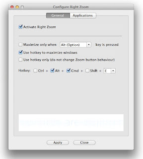
 As a big fan of screen real estate, I like for my windows to be as large as possible. Because the green button isn't reliable for a full-size toggle, I end up doing a lot of manual clicking-and-dragging from the edge of a window. One day in my Internet travels, I encountered a little tool called Right Zoom (downloadable here) that allows you to mandate the action of the green button.
Using this program allows you to have the green button behave similarly to the maximize button in Windows. You can also set a hot key which, when pressed, allows you to have the green button behave in a specific way. You can also set the green button to perform different ways with different applications.
As soon as I started using Right Zoom, resizing windows was a breeze. The beauty is that you don't even have to worry about the program itself. It's not even like it's a utility. I'd describe it as more like an extension of a system preference pane. All you need to do is download it, set it up how you want and forget about it.
I would recommend this tool for anyone who likes to use as much screen space as possible and likes to keep things simple in the process.
Subscribe to:
Comments (Atom)


